When people talk about brand identity, the logo often becomes the centre of the conversation.
“What should the logo look like?”
“What font should we use?”
“What colours should the brand have?”
Those questions matter.
But your logo is only one part of the identity.
Imagine removing your logo from your packaging, website or social media.
Would there still be something recognisable about the brand?
Could someone identify the brand through the photography?
The colour combination?
The typography?
The packaging shape?
The way products are styled?
The tone of the copy?
The visual rhythm of the content?
Those are the kinds of details that can gradually build recognition.
Your identity becomes stronger when people can recognise the brand through multiple cues, not just one symbol. This is part of what makes a strong beauty brand identity more than just a logo.
This broader view of brand identity also aligns with how the American Marketing Association discusses branding and brand identity.
Think of your visual identity as a language.
Your colours are part of that language.
Your typography is part of it.
Your photography is part of it.
Your layouts, graphic elements, packaging and imagery are part of it too.
Individually, these things may not seem especially powerful.
Together, they create a visual vocabulary.
For example, imagine a beauty brand that consistently uses warm neutrals, close-up product photography, generous negative space and understated typography.
One Instagram post may not be enough to identify the brand.
But after seeing that visual language repeatedly, your brain starts making the connection.
That’s how brand recognition grows.
The goal isn’t necessarily to make every piece of content look identical.
It’s to make different pieces feel like they came from the same world.
This is where consistency becomes important.
Not the kind of consistency that means posting the exact same template every Tuesday.
The kind that creates familiarity.
If your brand uses five completely different visual styles depending on the week, people have to relearn what your brand looks like every time they encounter it.
One week your content is minimal and editorial.
The next it’s colourful and playful.
Then it’s heavily text-based.
Then it’s dark and luxurious.
None of those styles are necessarily bad.
The problem is that they may not belong to the same brand.
A recognisable identity gives you a set of creative boundaries.
They help strengthen brand recognition because they make your brand easier to identify across different touchpoints, they don’t limit creativity.
They make your creativity more intentional.
Beauty is one of the fastest-moving visual categories.
There is always a new aesthetic.
A new packaging trend.
A new photography style.
A new font everyone suddenly loves.
A new way to arrange products on a shelf.
And it can be tempting to keep updating your brand so it never feels “behind.”
But there’s a difference between evolving your brand and constantly replacing its visual identity. If you’re also trying to understand what makes a beauty brand genuinely different, beauty brand differentiation is a useful place to start.
If you change everything every time the industry changes, you may remain visually current while losing the things that made your brand recognisable.
A strong identity should be able to adapt.
But it should have something underneath it that remains familiar.
That might be your colour system.
Your photography approach.
Your typography.
Your packaging structure.
Your tone of voice.
Your use of space.
Or simply a particular feeling that everything continues to communicate.
Colour is one of the fastest ways people recognise a brand.
This makes colour an important part of brand recognition, especially when the same colour system appears consistently across different touchpoints.
But choosing colours simply because they’re beautiful isn’t enough.
Ask:
What should these colours make people feel?
And:
How ownable are they within your category?
If every beauty brand around you is using the same beige, cream and muted brown combination, using those colours isn’t automatically wrong.
But you need to understand what else will make your brand distinctive.
You also don’t need ten colours.
A thoughtful colour system can be much more useful than a large palette where every colour is competing for attention.
Think about where your primary colour appears.
Where your supporting colours appear.
How much white space you use.
How the colours work in photography.
How they translate to packaging.
How they appear on your website and social media.
Recognition comes from the system, not simply the swatches.
Over time, that system can become part of your brand recognition.
Typography is another part of identity that is often underestimated.
A typeface can influence whether a beauty brand feels:
Clinical
Editorial
Soft
Modern
Playful
Refined
Experimental
Approachable
But choosing an attractive font isn’t the same as creating a typographic identity.
Your typography needs a role.
Which typeface is used for headlines?
Which is used for body copy?
How much contrast exists between them?
How large are your headings?
How much space surrounds the text?
How does typography appear on packaging compared with your website?
Those decisions create patterns.
And patterns are useful for recognition.
Over time, these typographic patterns can contribute to brand recognition, even when the logo is not immediately visible.
Two brands can photograph the same product completely differently.
One might use bright studio lighting and clean backgrounds.
Another might use warm shadows, textured surfaces and intimate close-ups.
Another might focus heavily on people and real-life moments.
None is automatically better.
The question is:
Which visual world belongs to your brand?
Your photography direction should have some consistency in:
Lighting
Composition
Styling
Models
Backgrounds
Props
Camera distance
Texture
Mood
That doesn’t mean every photograph needs to look identical.
It means the creative choices should feel intentional.
Over time, those choices become part of how people recognise you.
They can also become familiar signals that strengthen brand recognition across campaigns and content.
This is also where creative direction for beauty brands becomes important, because the goal is to make individual creative decisions feel connected to the wider brand.
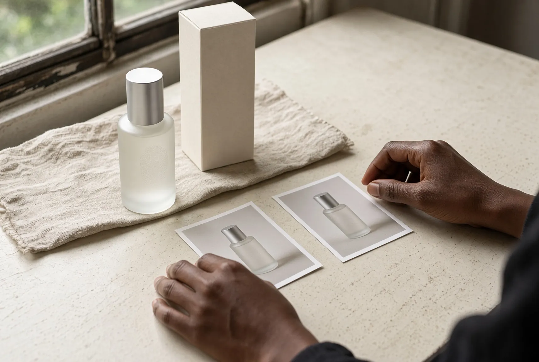
For beauty brands, packaging has an especially important role.
It’s often the first physical expression of the brand a customer encounters.
And unlike an Instagram post, packaging can stay in someone’s bathroom, bedroom or handbag for weeks or months.
That gives it repeated opportunities to build familiarity.
Think beyond the logo.
What does the bottle shape communicate?
How does the label hierarchy work?
What does the colour system look like across different products?
What stays consistent when you introduce a new product?
What changes?
A strong packaging system allows the product range to grow without every new product looking like it belongs to a completely different company.
That’s valuable because brand recognition should become stronger as your product range grows, not weaker.
Recognition isn’t purely visual.
Your words matter.
The way your brand describes a product.
The words you repeatedly use.
The way you educate.
The way you speak to customers.
The personality behind your captions.
All of these contribute to how the brand feels.
Imagine a beauty brand that always communicates in a calm, reassuring and knowledgeable way.
Even without seeing the logo, you may eventually recognise its voice.
That’s brand recognition too, because people can begin to associate a particular way of communicating with your brand.
Your visual identity and verbal identity don’t have to be identical.
But they should feel like they’re coming from the same personality.
There’s an important difference between being consistent and being repetitive.
If every Instagram post uses exactly the same layout, people may recognise the template.
That doesn’t necessarily mean they recognise the brand.
A strong identity gives you recognisable principles, not one visual formula.
Those principles give brand recognition room to develop without making your content feel repetitive.
You can change the composition.
Try a different campaign concept.
Introduce a new product.
Experiment with video.
Use a different photography setup.
The brand can still feel familiar because the underlying creative language remains intact.
That’s much more sustainable than trying to make every post look like the previous one.
If you’re trying to build a more recognisable beauty brand, look at the details people encounter repeatedly.
Ask yourself:
Can people recognise us without seeing our logo?
Do our colours feel intentional and distinctive?
Does our photography have a consistent point of view?
Does our packaging belong to the same visual world as our website?
Does our typography have a clear system?
Does our brand voice sound like us?
Could someone mistake our Instagram feed for another beauty brand’s feed?
That last question can be uncomfortable.
But it’s useful.
If your answer is yes, it doesn’t necessarily mean your brand is bad.
It means there may be an opportunity to become more distinctive.
You don’t need to make your brand louder.
You need to make its signals clearer. Clearer signals give brand recognition something consistent to build on.
Choose the elements that are important enough to repeat.
Maybe it’s a particular colour combination.
Maybe it’s a distinctive photography style.
Maybe it’s the way your packaging uses typography.
Maybe it’s a specific tone of voice.
Maybe it’s the combination of several subtle details rather than one obvious signature.
Then use those elements consistently enough for people to associate them with you.
Brand recognition is built through repetition.
Not overnight.
Not through one viral post.
Not because someone saw your logo once.
It happens because people encounter the same underlying brand signals again and again.
One of the biggest mistakes founders make is assuming that a brand refresh means everything has to change.
It doesn’t.
Sometimes your identity needs refinement rather than replacement.
Maybe your typography needs simplifying.
Maybe your colour palette has become too broad.
Maybe your photography no longer reflects the audience you’re trying to reach.
Maybe your packaging system isn’t flexible enough for new products.
Maybe your visual identity is strong but your content has become inconsistent.
These are problems you can solve without throwing away everything you’ve built.
A thoughtful evolution protects what people already recognise while making the brand more relevant.
It also protects the brand recognition you’ve already built instead of asking your audience to start learning the brand again.
That’s often much more valuable than chasing a completely new aesthetic every few years.
Here’s something you can do before changing anything.
Take your last ten pieces of content.
Remove the logo and brand name.
Put them next to each other.
Now ask:
Could I tell that these all belong to the same brand?
Then do the same with your packaging, website screenshots and campaign imagery.
Look for patterns.
What keeps appearing?
What feels distinctive?
What feels generic?
What changes too often?
What could someone easily mistake for another beauty brand?
Now choose three to five recognition cues you want your brand to become known for.
They could be visual, verbal or experiential.
For example:
Warm editorial photography
A distinctive muted colour system
Generous negative space
Clear, conversational education
Minimal but expressive packaging
Those cues become a useful creative filter.
Before approving a new piece of content, campaign or packaging concept, ask:
Does this strengthen the brand I want people to recognise?
That one question can prevent a lot of unnecessary creative decisions.
It’s easy to look at established beauty brands and think their identity was always obvious.
It wasn’t.
Recognition is built over time.
People need repeated exposure before certain colours, images, words, packaging or experiences become associated with your brand.
That’s why constantly changing direction can be expensive.
You’re not just changing your visuals.
You’re potentially asking your audience to learn you all over again.
You don’t need to get everything perfect from day one.
You need to make thoughtful choices, use them consistently and pay attention to what becomes strongly associated with your brand.
A memorable beauty brand isn’t necessarily the one with the most dramatic identity.
Sometimes it’s the one where every detail quietly reinforces the same idea.
The packaging feels like the website.
The photography feels like the packaging.
The content sounds like the experience.
The colours appear again and again.
The typography has a familiar rhythm.
Nothing has to be identical.
It simply needs to belong.
That’s what makes a beauty brand feel considered.
And over time, those repeated signals can become brand recognition.
That’s closely connected to the bigger goal of building a beauty brand people remember — not simply one that looks good at first glance.
So before you ask:
“Does my brand look good?”
Ask something more useful:
“Would someone recognise this as us if our logo disappeared?”
If the answer is yes, you’re building something much more valuable than a beautiful visual identity: brand recognition that can grow stronger with every interaction.
You’re building a brand people can remember.